
A Color Palette
I'm chugging away her at BFS headquarters getting the next TWO patterns ready for you all. That's right, two.
I'm so excited to announce these patterns this month. One pattern will be release both as a PDF and as a printed pattern, while the other (a simpler design) will be released as a PDF only. Perhaps in the future, the digital pattern will be available printed as well, but for now, my plan is to release a simple PDF only pattern with each larger printed release as a way to keep my business sustainable. But I'm really excited about the opportunities these patterns present and the possibilities of creating an outfit from separates :)
In the mean time, as I crunch numbers, edit, and devise pattern release strategies, I've been thinking about color. In this month's issue of Seamwork (an awesome online sewing magazine from Colette Patterns) there is an article about creating a personal color palette.
I've definitely gone through color phases. As a punk sixteener, I was fond of black and every possible combination of neon and animal print. In my late teens and into college, I made a complete 180 and confined myself to earthtones only. I wore quite a bit of brown, along with colors like avocado, moss, and harvest gold (and any other colors usually associated with 1970's home decor palettes).

Some pre-'selfie' selfies from my college days with my first phone camera

Though they seemed silly after the fact, I'm actually quite glad I took these for clothing documentation purposes. I often get nostalgic for some of my wacky art school garb
After college I tried to expand my color repertoire and found myself gravitating to blues. Indigo, chambray, lavenders, mauve and other cool tones. Perhaps it was part of a post-college re-invention. Changing your wardrobe and palette is tremendously transformative as part of a life change.
Rochelle over at Lucky Lucille wrote recently about being a blue-gravitating gal herself, but discovered that in spite of her attraction to the color, she felt she looked better in warmer tones: Golds, greens, orange, etc. As a fellow pinkish-toned person with dark hair, I was at first defiant. As an anarchist of style rules in most contexts, I felt the need to balk against this concept.

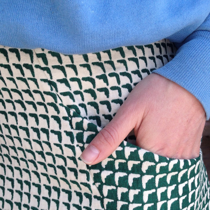
Saffron cardigan, black check, daffodils

green french terry
Then I bought some warm, olive green french terry. After putting on the top I'd made from it, I noticed my features pop and my overall look and complexion improve to me immensely. It was quite the opposite of what I expected. I also rediscovered a saffron yellow cardigan as the weather warmed up...low and behold, that same effect. Then I looked back at old photos and realized that I was indeed on to something with the earthtones in college.

More college earthtone selfies. Here's a clip from a video piece featuring a fantastic orange sweater.

I feel like this former pullover (gone now, sadly) is on its own the basis for a color palette.

This was a crazy sweater dress, plus copper cateye glasses.

I posed with this guy on tour with my old band in PA. I wore the striped tshirt pictured for years until it literally disintegrated.
Now, I don't know about you, but I read once that fair skinned folks should stay away from yellow and green, lest it make them appear wan and sickly. Friends, I found this to be quite the opposite. And thus, my spring palette reinvention begins.
Out of my strong desire to power sew a whole compatible wardrobe in a flash (ever had that feeling?) I looked in my fabric stash: Navy, indigo, mauve, lavender, pops of red and pink. I'd say nearly 75% of the fabric I have stashed fits that criteria. Mostly cool. In my closet, the same was clear.
So now I'm on a mission for my summer wardrobe and it falls into 3 projects:
1. Take loved garments (good shape, cut, print) that don't flatter and dye them!
We have a proliferation of Dockweed and Pokeberry in the garden, and an industrial sized spice container of turmeric and anatto. I think this is the summer I try some natural dyeing.
2. Make some garments in warm tones to wear with/complement my cool tones
I'm not getting rid of some of my faves, but perhaps they just need some warmth to balance them out.
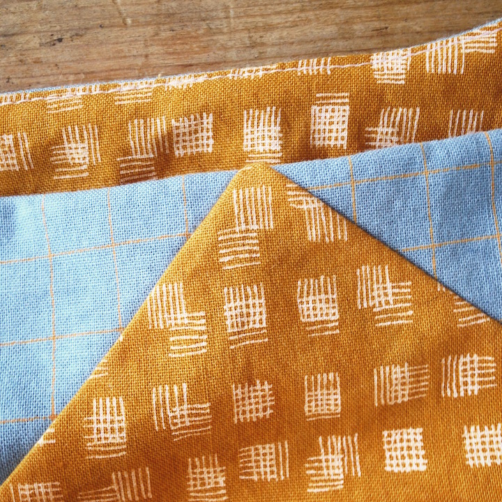
3. Create a color palette for fabric shopping/project planning.
I'll follow the Seamwork instructions and create a swatch booklet. I love this idea. Also plan to give each color appealing food-related name. So far I know I need: Olive, Saffron, Paprika, Pecan, Blood Orange, Cream, Salmon.
Are you planning a summer palette? Do you change your colors to be harmonious with your complexion or do you defiantly mix and match? Or do you just wear all black and call it a day?